We all have family photos hanging in our home. We cherish them! They bring us joy and comfort every time we look at them. But the trend now is to showcase your family art in new and exciting ways. Now, you don't just take the print and stick it in a pretty frame and find a great place to hang it.... no, it is much more than that now. We all have a personal gallery that is just waiting to be showcased to friends and family! Just imagine, walking into a home and the very first thing you see is this great center piece on the wall, it just screams "Look over here! This is my family and this is how much we love each other!"
So, just how do you go about this? How can you get that gallery effect in your own home?
Well, first of all we need to be sure we are selective with our photos! Yes, we all love every goofy and fun picture we have of our spouse or kids. I admit, that even I have some silly photos in frames too! But, as for a gallery level showcase, picking the right photo is key! Remember, though, this display should speak to YOU, most of all! Don't pick pictures that you think others will enjoy and leave out your true favorites! This is your home, your wall, and your memories... be sure to use the ones you love the most! Having said that, if you are picking more than one photo to showcase, be sure to keep a theme somewhat. For example, if you have kids in your family, take a family photo, center it on the wall and surround it with pictures of each member individually. That's just one idea! There are so many more! Just be creative, but be you!
Second, you need to frame it correctly! Frames are meant to enhance your photos, not distract the eye! The frame is not the subject, it's the accessory! Also, if you are showcasing more than one photo, keep the frames in the same category.... they don't have to be the same color or the same size or shape, but they should compliment each other and look cohesive. If you like the new frame-less canvas print look, which I personally love, then have fun with that too! Go with unusual shapes and sizes!
Another quick tip for a fresh approach to your family wall art.... go color blind! Black and white photos can have an entirely different effect on your subjects! Color is fun and bold, yet, in my opinion black and white photos are more dramatic and interesting! It's personal choice, of course!
Here are a few links to give you some ideas:
http://thebumbleinthebee.blogspot.com/2011/05/tutorial-repurposed-frames.html
http://www.flickr.com/photos/55397648@N00/4931320253/
http://puremotif.com/wp/wp-content/uploads/2011/01/hollyryan_metalprints.jpg
Be sure to share this post with your friends!!

Showing posts with label great. Show all posts
Showing posts with label great. Show all posts
Thursday, October 6, 2011


Tuesday, May 10, 2011
Composition - What in the world does it mean?
In the world of photography what does COMPOSITION mean?
Well, by definition it means, 'putting together'. Or think of it as organization.
 In the field of photography, organization is key to good art. Like I always say, you can't take a bunch of food, throw it in a bag, shake it up and expect a delicious meal to come out of it.... it takes effort and work and organization. You have to know just how much or how little to add of each ingredient. Relating to photography, you have to have all the correct ingredients, put in the right place at the right time, at the right angle in order to have a good photograph.
Depending on the photographer you ask, there are rules to composition. But, really they are more like guidelines, since, sometimes breaking the 'rule' is what is needed to create the end desired product.
So, here are some of the guidelines, I suggest for those of you who are interested in developing your skills, to take each one and research, practice, practice, practice it until you are comfortable with it and find your groove. Keep in mind, there are more composition guidelines than I have listed, this is just to give you a start.
 1. Rule of thirds. This is, in my opinion, one of the more important guidelines you must master and understand completely what it means and what it DOESN'T mean!
2. Pattern. Just like a meal with no spices is bland and boring, a photograph that doesn't capitalize on available patterns looses it's potential pizazz!
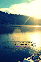 One suggestion for those of you who feel the need to better your photography skills, either for personal use or if you are considering a career in photography, is get familiar with good photographers. Learn what made the greats so great, such as Ansel Adams, Alfred Stieglitz, Dorothea Lange, Bernice Abbott, Anne Geddes, Edward Weston, Henri Cartier-Brensen, Richard Avedon... to name a few. Don't repeat their work, but feed off of their greatness, soak up their legacy. Have fun! Don't make it harder than what it is.
A good photograph, doesn't happen by chance. It's the product of good design and technique.
Well, by definition it means, 'putting together'. Or think of it as organization.

Depending on the photographer you ask, there are rules to composition. But, really they are more like guidelines, since, sometimes breaking the 'rule' is what is needed to create the end desired product.
So, here are some of the guidelines, I suggest for those of you who are interested in developing your skills, to take each one and research, practice, practice, practice it until you are comfortable with it and find your groove. Keep in mind, there are more composition guidelines than I have listed, this is just to give you a start.

2. Pattern. Just like a meal with no spices is bland and boring, a photograph that doesn't capitalize on available patterns looses it's potential pizazz!
3. Texture. Closely related to pattern, you must fully understand what it is, and how to apply it.
4. Angles. If your angle is off just a touch, you can loose the whole effect to the photograph. Especially in portrait photography, angles can either enhance the subjects or create a less attractive appearance. So, be cautious, and again, practice, practice, practice! Some angles work, but only in certain light, and circumstances.5. D.o.F. - Do you know what that is? Depth of Field. Look it up. Depending on what you are trying to accomplish, DoF will either enhance, or reveal your subject, or isolate it. It's not something that you can read about and simply have it mastered, again, practice!
 One suggestion for those of you who feel the need to better your photography skills, either for personal use or if you are considering a career in photography, is get familiar with good photographers. Learn what made the greats so great, such as Ansel Adams, Alfred Stieglitz, Dorothea Lange, Bernice Abbott, Anne Geddes, Edward Weston, Henri Cartier-Brensen, Richard Avedon... to name a few. Don't repeat their work, but feed off of their greatness, soak up their legacy. Have fun! Don't make it harder than what it is.
 As far as my collection goes, I look forward to adding to my portfolio this Summer. I will be doing a lot of portrait work, but I have also set out to enhance my landscape portfolio. So, look for it this Summer as I do, I will be putting into practice the composition guidelines in this blog post. Let's see how well I do this year, following my own advice!
A good photograph, doesn't happen by chance. It's the product of good design and technique.
That's the way I see it anyways! Until next time, stay Snap Happy my friends!
Subscribe to:
Posts (Atom)